The Power of Color
Color is one of the most powerful tools in design. Before people read your content or understand your message, they see color. Colors evoke emotional responses and influence behavior. Understanding color psychology is essential for creating designs that resonate with your audience and communicate your brand effectively.
How Colors Affect Perception
Research shows that color accounts for 60-90% of the initial assessment of a product or environment. Colors can increase brand recognition by up to 80%, and certain colors are associated with specific emotions and behaviors. This is why choosing the right color palette is crucial for your brand.
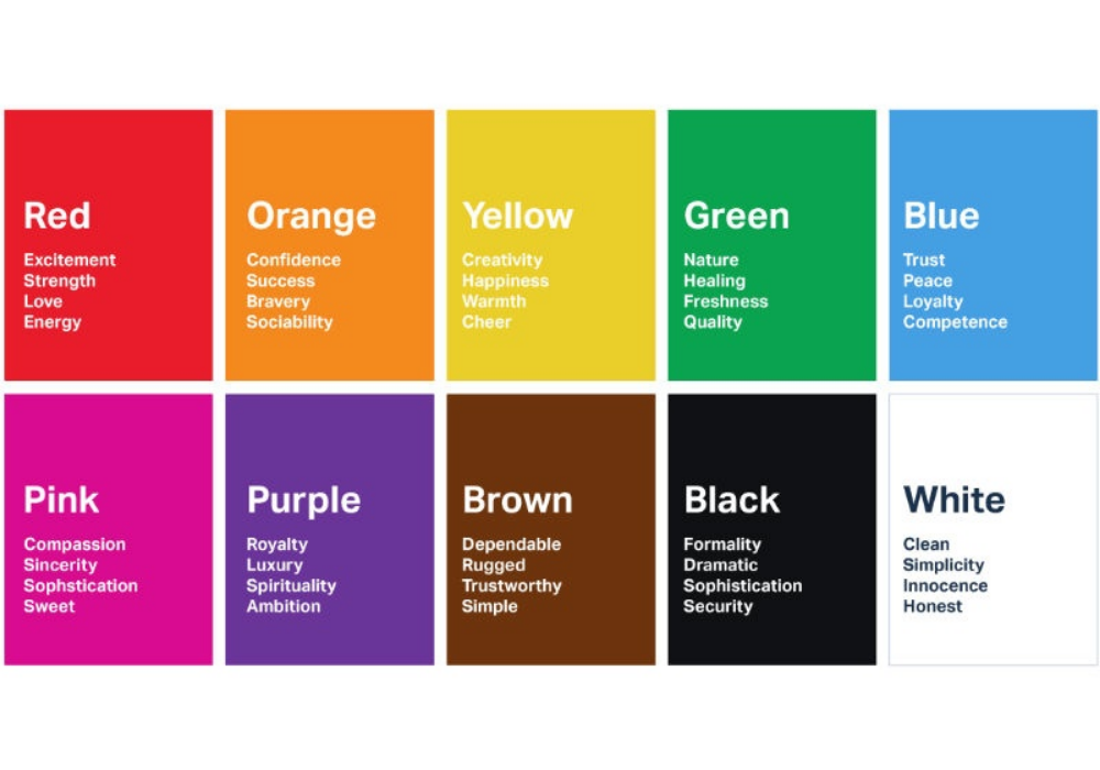
Color Psychology Basics:
- Red: Energy, passion, urgency, excitement. Often used for sales and promotions
- Blue: Trust, stability, professionalism, calmness. Popular in corporate and tech brands
- Green: Growth, health, nature, renewal. Associated with sustainability and wellness
- Yellow: Optimism, happiness, warmth, energy. Grabs attention and conveys friendliness
- Orange: Enthusiasm, creativity, playfulness. More approachable than red
- Purple: Luxury, creativity, wisdom, mystery. Associated with Premium brands
- Black: Sophistication, elegance, power, formality. Creates contrast and drama
- White: Clean, minimalist, simplicity, peace. Used for empty space and clarity
Cultural Considerations
Color meanings can vary across cultures. For example, white represents purity in Western cultures but symbolizes mourning in some Asian cultures. Red is lucky in Chinese culture but represents danger in Western contexts. When designing for global audiences, consider cultural color associations to avoid unintended meanings.
Building Your Color Palette
Primary Color
This is your brand's main color. It appears most frequently in your brand identity and should reflect your brand personality. Choose a color that differentiates you from competitors and resonates with your target audience.
Secondary Colors
These support your primary color and add variety without overwhelming. 2-3 secondary colors are typically sufficient. They should complement your primary color and work well together.
Accent Colors
Accent colors draw attention to important elements like buttons, links, or calls-to-action. Choose colors that contrast with your main palette and create visual hierarchy.
Color Relationships
Complementary Colors
Colors opposite each other on the color wheel (e.g., blue and orange, red and green) create high contrast and visual interest. Use complementary colors for dramatic, eye-catching designs.
Analogous Colors
Colors next to each other on the color wheel (e.g., blue, blue-green, green) create harmony and are pleasing to the eye. Use analogous colors for calm, cohesive designs.
Monochromatic
Using different shades, tints, and tones of a single color creates a sophisticated, unified look. Monochromatic designs are elegant and create strong visual hierarchy.
Accessibility & Contrast
Ensure sufficient contrast between text and background colors for readability. This is particularly important for people with color blindness or low vision. Use online contrast checkers to ensure your color combinations meet WCAG accessibility standards.
Color Trends
Color trends change seasonally and by industry. Pantone releases color predictions annually. While trends can inform your choices, remember that timeless color palettes outlast trendy ones. Balance trend-aware choices with long-term brand consistency.
Testing Your Palette
Before committing to a color palette, test it across different contexts: print, digital, web, mobile. See how colors appear in different lighting conditions and on different devices. Colors look different on screens versus print, so test in real-world applications.
Emotion and Branding
Your color palette should evoke the emotions you want associated with your brand. A healthcare brand might choose blues and greens to evoke trust and health. A luxury brand might choose blacks and golds to convey sophistication. Your colors should tell your brand story.
Conclusion
Color psychology is a powerful tool for designers. By understanding how colors influence perception and emotion, and by thoughtfully choosing colors that align with your brand values and target audience, you can create designs that not only look beautiful but also effectively communicate your message and drive desired behaviors.
Need help choosing the perfect color palette for your brand? Let's create something beautiful.